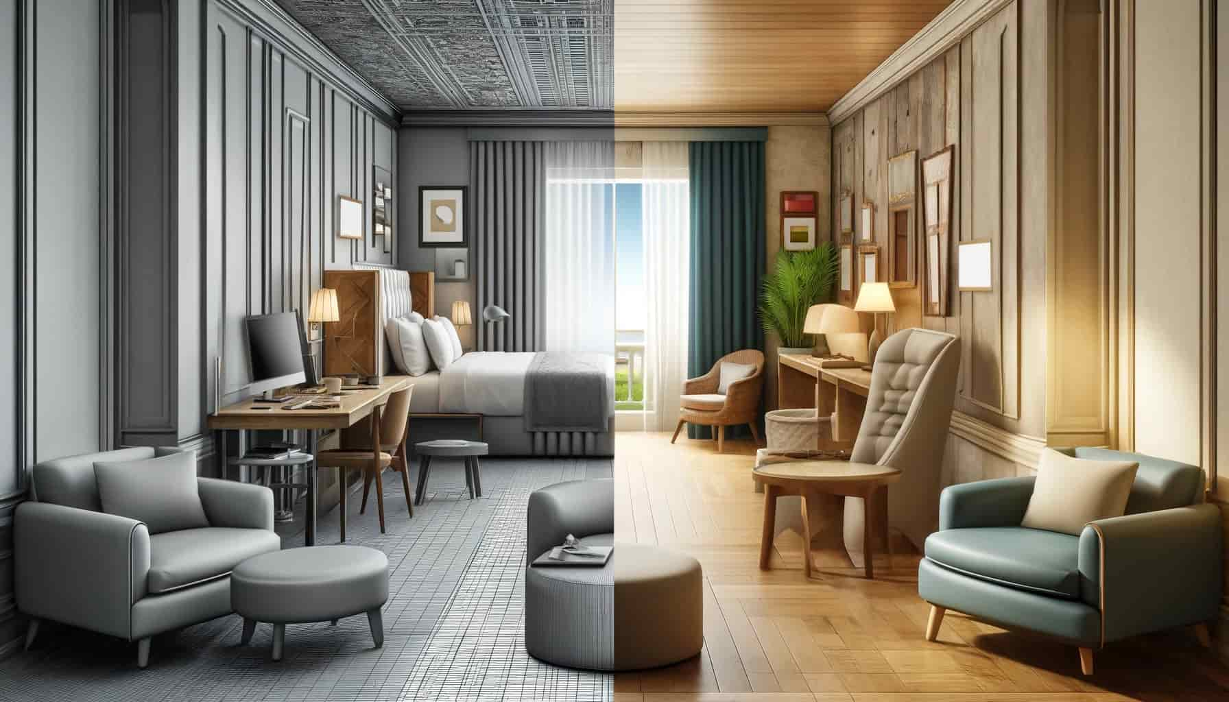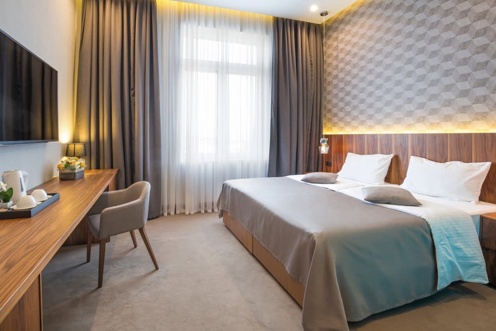

En bref
Hospitality design mistakes are the recurring errors — in lighting, furniture, acoustics, accessibility, storage and outdoor space — that leave a hotel or restaurant uncomfortable, dated or hard to use. Most cost far less to avoid at the specification stage than to correct after a guest complains.
Hospitality design mistakes rarely show up on a drawing — they show up in the reviews, the complaints and the rooms a guest quietly decides not to book again. A hotel or restaurant can spend heavily on a scheme and still get the fundamentals wrong: lighting that flattens a room, seating chosen for the photograph rather than the sitter, or storage a guest never finds. This guide walks through the hospitality design mistakes that cost properties most, why each one drives guests away, and how an owner heads them off at the specification stage. Because so many of these errors trace back to the furniture, the Meubles d'hôtel you specify is usually where the fix starts.
What Hospitality Design Mistakes Actually Cost
Réponse rapide
Hospitality design mistakes cost a property in three currencies: guest reviews, repeat bookings and retrofit budgets. A flaw that costs little to fix on the drawing — a seat too low, a room too dim — turns expensive once complaints gather and the correction has to roll across a finished property.
The first thing to understand about a design mistake is where the bill lands. It rarely lands on the day the room opens. It lands weeks later, in a review that names the uncomfortable chair, in a guest who asked to change rooms, in the third complaint about noise from the corridor. Common guest complaints about hotel interiors almost always trace back to a design decision made months earlier, and by then the cheap fix has become an expensive one.
For an owner or a purchasing team, that timing is the whole argument for catching these errors early. A chair that proves too low costs a few minutes to correct on a specification and a small fortune to swap out across two hundred rooms. The properties that avoid the worst of these mistakes are not the ones with the largest budgets; they are the ones that test the decisions before they multiply. The sections below cover the mistakes that recur most often across hotel and restaurant projects, each with the fix that belongs at the drawing stage rather than the complaint stage.
A mistake found late multiplies by the room count
The single reason these errors hurt is repetition. One wrong chair in a showroom is a sample; the same chair signed off and installed in every room is a project-wide problem. Test the decisions that repeat — seating, casegoods, lighting — on one room before they reach a hundred.
Lighting That Flattens the Room
Lighting is the most underrated tool in hospitality design and the easiest to get wrong. Many properties land at one of two extremes: a single overhead source that floods the room flat and cold, or a scheme so dim that guests cannot read, work or see their own luggage. Both read as cheap, and both undo the work the furniture and finishes are trying to do.
The fix is to layer. Ambient light sets the base level, task light serves the desk, the bedside and the mirror, and accent light gives the room depth and warmth. Warmer colour temperatures suit guest rooms and lounges, where the goal is rest rather than alertness, while guest-controlled dimming lets a single room serve a business traveller at the desk and a couple winding down at night. A room lit in layers feels considered; a room lit by one switch feels like an afterthought, and guests read the difference instantly.
Furniture Chosen for Looks, Not Use
The most expensive hospitality design mistakes sit in the furniture, because furniture is the element a guest actually touches. A property invests in pieces that photograph beautifully, then discovers that the lounge chair is too low to rise from, the desk chair punishes a long working session, or the sofa looked generous in the showroom and swallows the room in place. A piece that fails the body fails the stay, however well it suits the mood board.
Two errors recur. The first is comfort: seating specified by appearance rather than ergonomics, with seat heights, depths and back angles that ignore how a guest will actually use the piece. The second is layout: furniture arranged for a photograph rather than for movement, leaving rooms that feel cramped or routes a guest has to squeeze through. Commercial seating for hospitality projects carries challenges a residential piece never faces — constant turnover, heavy daily use, cleaning regimes — and furniture that ignores them wears out and disappoints in equal measure.
The fix is to specify for use first and looks second, and to insist on contract-grade construction that survives the traffic. The deeper principles of getting the pieces right — proportion, finish, the styles that hold up over time — sit in our guide to hotel furniture design; the point here is simpler: a beautiful room a guest cannot sit in comfortably is a design mistake no finish can rescue.
Buying residential furniture for a commercial room
The cheapest way to create a future complaint is to specify residential-grade furniture for a hospitality space. It looks the part on day one, then loosens, sags and scuffs under use a home piece never sees. Contract-grade frames and fire-rated foams cost more once and save the property the cost of replacing them early.
Ignoring Acoustics
Sound is the mistake nobody sees and every guest hears. A room can look immaculate and still earn a one-star review because the corridor carries every footstep, the restaurant turns into a roar at full covers, or the neighbouring room might as well share a wall of paper. Hard, fashionable surfaces — bare floors, glass, exposed concrete — look sharp and bounce noise around a space until it becomes unpleasant.
Furniture is part of the answer here, not just the finishes. Upholstered seating, fabric headboards, curtains and rugs absorb sound that hard surfaces throw back, and acoustic panels handle the rest where a room runs loud. Designing for quiet is rarely about one dramatic measure; it is about choosing enough soft, absorbent pieces that a space stays calm at full occupancy. Owners who treat acoustics as an afterthought pay for it in reviews that the prettiest scheme cannot offset.
Designing Out Accessibility
Accessibility is both a legal expectation and a commercial one, yet it remains one of the more common hospitality design mistakes. A scheme that looks elegant but leaves a wheelchair user unable to reach the desk, turn in the bathroom or pass between the bed and the wall has failed a part of its market before it opens. The error usually comes from treating access as a box-ticking add-on rather than a design input from the first sketch.
The fix is to build it in early. Clearances that let a guest move freely, furniture at heights that work seated or standing, bathrooms planned around grab rails and turning circles, and clear signage all belong in the original brief, not in a retrofit. The principles of universal design — spaces that work for the widest range of guests without special adaptation — give a useful frame, and furniture specified with those clearances in mind resolves most of the problem before it starts.
Chasing Trends Over Timeless Design
A property that chases every trend ages faster than one that ignores them. Bold, of-the-moment finishes and statement furniture look current for a season or two, then date hard and force an early refresh the budget never planned for. The mistake is committing the permanent, expensive elements — the casegoods, the seating frames, the fixed finishes — to a look with a short shelf life.
The fix is to split the scheme by lifespan. Keep the permanent layer timeless: neutral palettes, classic proportions, durable finishes that hold their line across a full cycle. Then express the trend in the cheap, swappable layer — cushions, throws, art, accent pieces — that a property can update without a full renovation. A room built this way reads as current for years and refreshes for a fraction of the cost, while a room built entirely on a trend reads as dated the moment the trend moves on.
Too Little Storage
Guests notice storage only when there is not enough of it, and then they notice nothing else. A room with no clear place for a suitcase, too few hangers, and surfaces already crowded by the furniture forces a guest to live out of an open bag for the length of the stay. The clutter that follows makes even a well-finished room feel cramped and unconsidered.
The fix lives in the casegoods. Built-in wardrobes with enough hanging space, a dedicated luggage stand or bench, drawers that actually hold a guest’s belongings, and surfaces kept clear for use rather than decoration all design the clutter out. In compact rooms, furniture that earns its footprint — storage built into the bed base, the desk and the headboard — recovers space a separate piece would waste. Storage is rarely the glamorous part of a brief, but its absence is one of the quietest and most common of these mistakes.
Wasting the Outdoor Space
An underused terrace, a bare poolside or a patio with nowhere comfortable to sit is a missed asset, and one of the most overlooked of these mistakes. Outdoor space carries real commercial value — it extends the usable area, photographs well and gives guests a reason to linger and spend — yet many properties leave it as an afterthought with a few stacked chairs and no shade.
The fix treats the outdoor area as a designed room rather than leftover ground. Comfortable, weatherproof contract seating, shade that makes the space usable through the day, lighting that brings it to life after dark, and greenery or a water feature to anchor it turn dead ground into one of a property’s busiest rooms. Outdoor and poolside furniture has to survive sun, rain and pool chemicals, so the specification matters as much as it does indoors; a piece that fades or rusts in a season simply moves the mistake outside.
How to Avoid These Hospitality Design Mistakes
The thread running through every one of these errors is the same: they are cheap to prevent and expensive to correct. Avoiding hospitality design mistakes is less about taste and more about discipline at the specification stage, where a handful of habits catch the problems before they multiply across a finished property.
Three habits do most of the work. First, specify for use before looks — pin down comfort, durability and clearances, then choose the finish. Second, build and sign a mock-up room: one fully fitted sample reveals the low chair, the dim corner or the missing storage while the fix is a single piece rather than a hundred. Third, brief the furniture maker on how the space will actually run — the traffic, the cleaning, the turnover — so the maker builds the pieces for the reality, not the photograph.
Good design is, in the end, the absence of these mistakes more than the presence of any one flourish. How that same discipline turns into a stay a guest remembers for the right reasons sits in our guide to furniture design and the guest experience. Get the fundamentals right — comfort, light, quiet, access, storage and a space that lasts — and the scheme earns the reviews the budget was chasing all along.
Furniture briefed for how the space runs
We build contract furniture to a project specification for properties across more than thirty countries, with West Africa and Ghana among our established markets. Briefing the maker on the traffic, the cleaning and the layout up front is how a project designs out the furniture-related mistakes before the first room goes in.
Foire aux questions
What are the most common hospitality design mistakes?
The recurring hospitality design mistakes are poor lighting, furniture chosen for looks over comfort, neglected acoustics, missing accessibility, trend-led schemes that date fast, too little storage, and wasted outdoor space. Each traces back to a specification decision and is cheaper to avoid early than to correct after guests complain.
What is the most common mistake in hotel furniture selection?
Specifying residential-grade furniture for a commercial space is the most common error. It looks right on opening day, then loosens, sags and scuffs under hospitality traffic a home piece never faces. Contract-grade frames and fire-rated foams cost more once and spare the property an early replacement.
How do design mistakes affect guest reviews?
Most negative reviews about a room name a design decision: an uncomfortable chair, a dim corner, noise through the wall, nowhere to put a suitcase. Guests rarely critique the concept; they react to how the space feels to use, which is where design mistakes surface first.
How can a hotel avoid hospitality design mistakes?
Avoiding these mistakes is a matter of discipline: specify for use before looks, build and sign a mock-up room to catch flaws on one room rather than a hundred, and brief the furniture maker on how the space will actually run. Most errors fail this simple test early.
Why do trendy hotel interiors date so quickly?
Trend-led interiors date fast when a property commits its permanent, expensive elements to a short-lived look. The fix is to keep the casegoods, seating frames and fixed finishes timeless, and to express the trend only in cushions, art and accents that swap out cheaply.
Why do outdoor hospitality spaces often fail?
Outdoor spaces fail when a property treats them as leftover ground rather than a designed room. Without comfortable contract seating, shade, lighting and weatherproof specification, a terrace or poolside stays empty. Furniture that survives sun, rain and pool chemicals turns dead space into a property’s busiest area.