A guest forms an impression of your restaurant in the first few seconds, and color in restaurant interior design does most of that work before a single dish arrives. Palette sets the mood, nudges the appetite, signals the price tier and tells guests how long to stay — all at once. Color also has to agree with the furniture in the room, so the wall, the timber tone and the upholstery read as one idea; you can see how those finished pieces come together in our restaurant furniture collection. This guide explains how to use color deliberately.
This guide walks through the psychology of color in a dining room, how to build a scheme that holds together, the way light and material change a palette on the wall, and the current trends shaping restaurant interiors. Every recommendation treats the room as a working restaurant, not a home renovation — color that supports service, turnover and a brand rather than decoration alone.
Быстрый ответ
What is the role of color in restaurant interior design? Color sets the mood, shapes appetite and controls the pace of a meal. Warm tones — reds, oranges, terracotta — feel inviting and stimulate appetite, which suits social and fast-casual rooms; cool tones — blues and greens — calm and slow a space, which suits upscale and relaxed dining. Build the scheme on a proportion rule such as 60/30/10, coordinate it with the furniture finishes and the lighting, and let one accent carry the brand. The right palette makes guests comfortable and quietly serves the business.
Why Color in Restaurant Interior Design Shapes Mood
Color reaches guests faster than any other design choice. Before they read the menu or notice the furniture in detail, the palette has already told them whether the room feels warm or cool, casual or refined, energetic or calm. That speed gives color in restaurant interior design an outsized role: it frames the whole experience in the first glance, and a palette that fights the concept undermines everything that follows.
The psychology of color in a dining room
Different colors trigger different responses, and a dining room puts that psychology to work. Warm colors lift energy and draw people in, cool colors calm and settle them, and neutrals give the eye somewhere to rest between the two. None of this is decoration for its own sake — the palette steers how a guest feels in the seat, which shapes how they order, how long they stay and whether the room feels right for the occasion. A restaurant that understands the psychology chooses color for the response it wants, not the shade it likes.
Color sets the pace of a meal
Palette quietly controls turnover. Bright, warm and high-contrast schemes energise a space and keep it moving, which fast-casual rooms and cafés want, while softer, deeper and cooler palettes slow the pace and invite guests to linger, which fine dining rooms build their margins on. The same room repainted in a different key turns its tables faster or slower. Decide the dwell time your concept needs first, then choose a palette that delivers it — the way the right seating does, as our pillar on how to choose restaurant furniture explains across the whole room.
Color is a lever on turnover, not just a look
Operators treat palette as decoration and miss that it tunes the pace of the room. A warm, energetic scheme nudges guests to eat and move, lifting covers in a fast-casual space; a cool, soft scheme invites lingering and higher spend per table in fine dining. Choose the palette for the turnover you want, and color starts earning its place on the balance sheet.
Color Psychology: What Each Color Does in a Restaurant
Each color family carries a fairly consistent effect on mood and appetite, and a restaurant uses those effects on purpose. The table below sets the main color families against the response they trigger and the rooms they suit, so you match the palette to the experience rather than the trend.
| Color family | Effect on mood | Appetite | Лучше всего для |
|---|---|---|---|
| Red & warm pink | Energetic, stimulating, social | Stimulates appetite | Social, lively, fast-casual rooms |
| Orange & terracotta | Warm, welcoming, comforting | Encourages appetite | Casual dining, bistros, cafés |
| Yellow & ochre | Cheerful, bright, optimistic | Lifts appetite in moderation | Breakfast, cafés, family rooms |
| Green | Natural, fresh, balanced | Reads healthy and fresh | Health-led, farm-to-table, biophilic rooms |
| Blue | Calm, cool, trustworthy | Tends to suppress appetite | Seafood, upscale, relaxed dining |
| Neutrals & earth tones | Grounded, timeless, flexible | Neutral; lets food stand out | Most concepts as a base palette |
| Dark & moody tones | Intimate, dramatic, premium | Focuses attention on the plate | Fine dining, bars, evening rooms |
Reds, oranges and warm tones
Warm colors do the work most restaurants want. Red raises energy and stimulates appetite, which is why so many lively and fast-casual rooms use it, though a whole room of strong red overwhelms — it works best as an accent or in a deeper, muted shade. Orange and terracotta bring the same warmth with more comfort and less intensity, which makes them a favourite for bistros and cafés. Yellow and ochre add cheer and suit daytime rooms. Across the warm family, the rule holds: warmth invites guests in and encourages them to eat.
Blues, greens and cool tones
Cool colors calm a room and slow its pace. Blue reads trustworthy and serene and suits seafood, upscale and relaxed concepts, though it can suppress appetite, so most rooms use it as a supporting tone rather than the dominant one. Green signals freshness, nature and health, which makes it the natural choice for farm-to-table and biophilic rooms where plants and timber reinforce it. Used well, cool tones create the unhurried mood that fine and relaxed dining build their experience on.
Color and the food on the plate
Color does not stop at the walls; it frames the food itself. A neutral or warm-toned room makes a plate of food look richer and more appetising, while a cold or heavily saturated background can fight the dish for attention. Designers who think about the plate keep the immediate surroundings — the table surface, the wall behind the seat, the upholstery — in tones that flatter food rather than compete with it. The result reads as appetising before a guest lifts a fork, which is the quiet goal of every restaurant palette.
Neutrals, earth tones and dark palettes
Neutrals and earth tones carry most successful restaurant schemes because they flatter food and last beyond a trend. Warm whites, taupes, clays and soft greys give the room a calm, timeless base that lets the food, the furniture and a single accent do the talking. Dark and moody palettes — deep greens, charcoals, navy — create intimacy and drama, focus attention on the candlelit plate, and read as premium, which is why fine dining and evening bars reach for them. A dark room asks for careful lighting and warm material tones to stay inviting rather than cold.
How to Choose a Color Scheme for Restaurant Interior Design
A palette works when its colors hold a clear hierarchy, so choosing a color scheme for restaurant interior design starts with proportion, not shade. Pick too many equal colors and the room feels busy; give one dominant tone, one secondary and one accent, and the scheme reads as intentional.
The 60/30/10 rule
The 60/30/10 rule keeps a palette balanced. Give roughly 60 percent of the room to a dominant color — usually a neutral or earth tone on the walls and large surfaces — 30 percent to a secondary color that supports it on furniture and upholstery, and 10 percent to an accent that carries the brand and draws the eye. The proportions stop a room from feeling either flat or chaotic, and they give every later choice a frame. Some designers run a softer 70/20/10 split for an even calmer base; the principle stays the same.
Building a palette around your brand
The accent is where the brand lives, so build the palette around it. Start from the one color that says most about the restaurant — a signature shade from the logo, the cuisine or the story — then choose a neutral base and a secondary tone that let it shine. A disciplined palette of three or four colors, repeated across walls, furniture and details, reads as a designed identity rather than a collection of choices. Restraint is what separates a branded room from a busy one.
Color and your concept
The scheme has to match the concept, because the same palette serves different rooms differently. Fine dining leans on deep, cool or dark tones that slow the pace and signal a tier; casual dining and bistros use warm, comfortable colors that turn tables and feel welcoming; cafés and fast-casual rooms favour bright, energetic palettes that keep the space moving. Decide which concept you serve, then let the palette reinforce it — and coordinate the furniture finishes to match, as our note on choosing столы в ресторане shows where finish meets the scheme.
Color, Light and Material Work Together
A color never appears alone. Lighting and the materials in the room change how every shade reads, so a palette chosen on a screen can look entirely different on the wall. Treat color, light and material as one decision and the room holds together; treat them separately and the finished space surprises you.
How lighting changes color
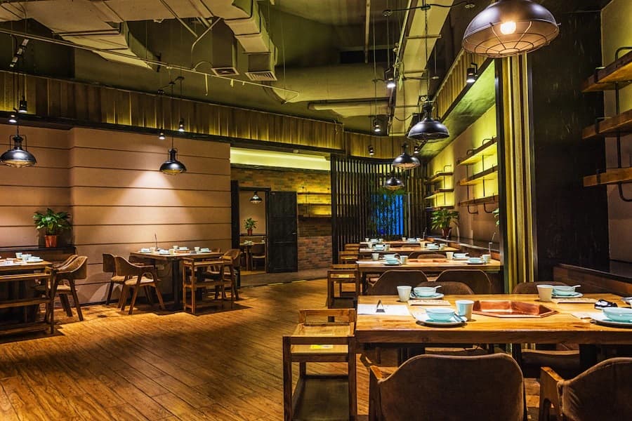
Light temperature rewrites a palette. Warm lighting deepens reds, oranges and timber tones and flatters skin and food, which is why most dining rooms light warm; cool lighting sharpens blues and greys and can leave a warm scheme looking flat or a cool one feeling clinical. The same paint reads rich under warm light and washed-out under cool, so choose the lighting and the palette together and test them in the actual room. For the fittings that set this tone, our restaurant and hotel lighting range covers the warm, layered light a dining room needs.
Coordinating color with furniture and finishes
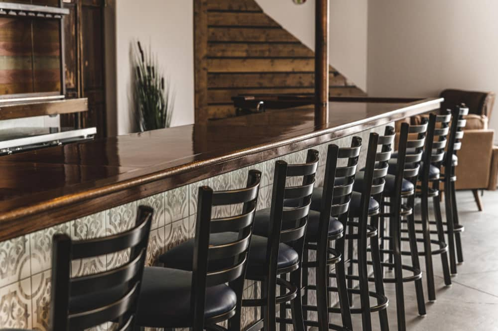
Furniture carries a large share of a room’s color, so the palette has to include it. Timber tones — the honey of oak, the pale of ash, the dark of walnut — act as colors in their own right and should sit inside the scheme rather than clash with it; our guide to wood types for restaurant furniture covers how each tone reads. Metal finishes, stone tops and flooring add their own notes. Coordinate them all under the 60/30/10 frame, and the furniture reinforces the palette instead of competing with it.
Upholstery and booth color
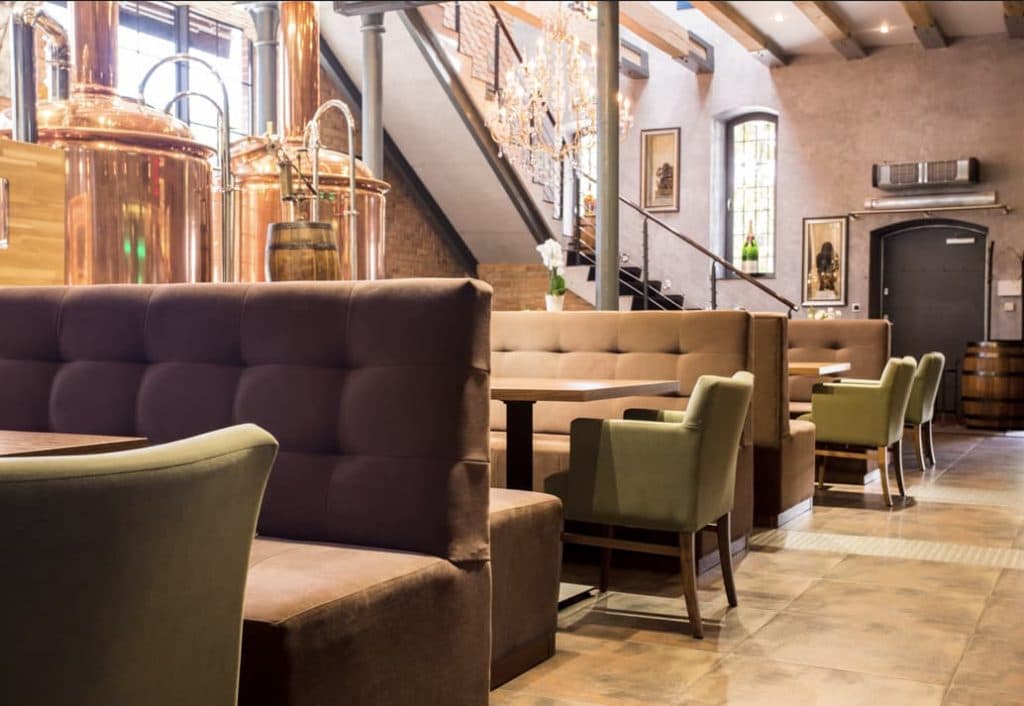
Upholstery is the easiest place to introduce the secondary color or the accent, because a banquette or a run of chairs covers a large, eye-level surface. A deep upholstery tone anchors a scheme, while a bright fabric becomes the room’s accent; either way, the fabric has to meet contract standards as well as the palette. Our breakdown of restaurant booth seating covers the contract-grade fabrics that hold both the color and the daily wear.
A palette chosen on a screen is not the palette on the wall
Designers approve colors on a monitor and then watch the room look wrong under its own lighting and against its own timber. Light temperature and material tone shift every shade, so paint a large sample on the actual wall and view it under the real fittings before you commit. The test costs a sample pot and saves a repaint.
Color by Zone in a Restaurant
A restaurant is not one space but several, and each zone asks something different of color. A palette that flows from the entrance to the dining room to the bar guides guests through the room and keeps the whole feeling coherent.
Entrance and waiting area
The entrance sets the first impression, so its color makes the promise the rest of the room keeps. A warm, confident tone here welcomes guests and signals the tier; a brand accent at the host stand or on a feature wall plants the identity in the first glance. Keep the palette consistent with the dining room beyond, so the transition feels designed rather than abrupt.
The dining room
The dining room carries the dominant and secondary colors, and it is where the 60/30/10 frame does most of its work. Hold a calm, flattering base across the walls and large surfaces, let the furniture carry the secondary tone, and reserve the accent for the details that draw the eye. This is the zone where color most directly shapes appetite and pace, so tune it to the experience the concept promises.
Bar and accent zones
The bar and feature zones earn a bolder hand. A deeper, richer or darker palette at the bar creates a destination within the room and reads as a place to linger, while an accent wall, a piece of local art or a striking material gives the space a focal point. These zones can break from the dominant tone precisely because the rest of the room holds steady — contrast works when it sits inside a disciplined scheme.
Color in Restaurant Interior Design: Trends and Common Mistakes
Trends move, but the fundamentals of color in restaurant interior design hold. Read the trends for direction, then apply them through a disciplined palette rather than chasing a single fashionable shade across the whole room.
The color trends shaping restaurant interiors
The clearest current shift moves away from cool grey toward warmer, earthier tones — terracotta, clay, warm browns, deep greens and warm neutrals that feel grounded and natural. Biophilic palettes that pair greens with timber and stone keep growing, and saturated jewel tones appear as accents in upscale rooms. The thread through these trends is warmth and a connection to natural material, which suits restaurants because it flatters food and feels welcoming. Adopt a trend through the accent and the secondary tone, and the room stays current without dating quickly.
Common color mistakes
Most color regrets trace back to a few errors. Rooms use too many competing colors and lose any hierarchy; they pick a palette on a screen and ignore how light and timber change it; they cover whole walls in a strong appetite-suppressing tone; or they chase a trend so hard the room dates within two years. The fix is the same in every case: hold a disciplined three-or-four-color palette, test it in the real room, and let the food and the furniture share the stage.
Testing color before you commit
The cheapest insurance in a fit-out is a sample. Paint a large patch of each candidate on the actual wall, set the real furniture finishes beside it, and view it under the lighting the room will use, at the times of day it will serve. A palette that survives that test holds up on opening night; one chosen from a swatch under a showroom light often does not. Test first, commit second, and the room delivers the mood you designed.
Часто задаваемые вопросы
What is the role of color in restaurant interior design?
Color sets the mood, shapes appetite and controls the pace of a meal. Warm tones feel inviting and stimulate appetite, which suits social and fast-casual rooms; cool tones calm and slow a space, which suits upscale dining. Color also carries the brand and has to agree with the furniture and the lighting, so the whole room reads as one idea.
What colors are best for a restaurant?
There is no single best color — the right palette matches the concept. Warm reds, oranges and terracottas energise casual and fast-casual rooms; deep, cool and dark tones suit fine dining; neutrals and earth tones make a flattering base for almost any concept. Build the scheme on a dominant neutral, a supporting tone and one brand accent.
What color increases appetite in a restaurant?
Warm colors stimulate appetite the most. Red raises energy and appetite, while orange, terracotta and warm yellow feel comforting and encourage eating, which is why so many casual and fast-casual rooms use them. Use strong warm tones as accents rather than across whole walls, where they can overwhelm.
What is the 60/30/10 rule in restaurant decor?
The 60/30/10 rule splits a palette into proportions: about 60 percent a dominant color on walls and large surfaces, 30 percent a secondary color on furniture and upholstery, and 10 percent an accent that carries the brand. The proportions keep a room from feeling flat or chaotic. Some designers use a softer 70/20/10 split for a calmer base.
What colors should you avoid in a restaurant?
Avoid covering whole walls in strong, appetite-suppressing tones such as heavy blue, and avoid crowding a room with too many competing colors that lose any hierarchy. Very cool or stark palettes can feel clinical under the wrong light. The safer path is a disciplined neutral or earth-tone base with a single warm or brand accent.
How does lighting affect restaurant color?
Lighting changes how every color reads. Warm light deepens reds, oranges and timber and flatters food and skin, while cool light sharpens blues and greys and can leave a warm scheme looking flat. The same paint looks rich under warm light and washed-out under cool, so choose the palette and the lighting together and test them in the real room.
What color is replacing grey in restaurants?
Warm, earthy tones are replacing cool grey — terracotta, clay, warm browns, deep greens and warm neutrals that feel grounded and natural. These tones flatter food, pair well with timber and stone, and read as welcoming rather than clinical, which suits restaurants. Bring a trend in through the accent and secondary tones rather than the whole room.