The role of color in restaurant interior design is one of the most important factors in creating a memorable and appealing dining environment. Color influences customer emotions, dining habits, and overall perception of the restaurant’s atmosphere. Studies in restaurant color psychology suggest that different colors can stimulate appetite, create a sense of relaxation, or even encourage faster table turnover.
Choosing the right color schemes for restaurant interiors can enhance branding, customer experience, and functionality. While warm colors like red, orange, and yellow tend to stimulate hunger and energy, cool tones like blue, green, and purple promote calmness and relaxation.
In this guide, we will explore the best colors for restaurant design, how color impacts dining behavior, and tips on choosing the right color palette to match your restaurant’s theme.
Table of Contents
ToggleThe Psychology of Color in Restaurant Design
1. How the Role of Color in Restaurant Interior Design Affects Customer Emotions
Every color affects human psychology differently. Understanding the role of color in restaurant interior design can help you create an environment that aligns with your brand identity and target audience.
Red & Orange: Stimulate appetite, increase energy, and create a sense of excitement.
Yellow: Encourages happiness and sociability but should be used in moderation.
Blue & Green: Evoke calmness and relaxation, making them ideal for fine dining and eco-friendly restaurants.
Black & Gray: Add sophistication and luxury but should be complemented with warmer tones.
Tip: Use restaurant color psychology to design a space that enhances the overall dining experience and influences customer behavior.
2. Best Colors for Different Types of Restaurants
The best colors for restaurant design depend on the type of restaurant and its target audience.
Fast-Food Restaurants: Use bright, bold colors like red, orange, and yellow to encourage quick dining and high table turnover.
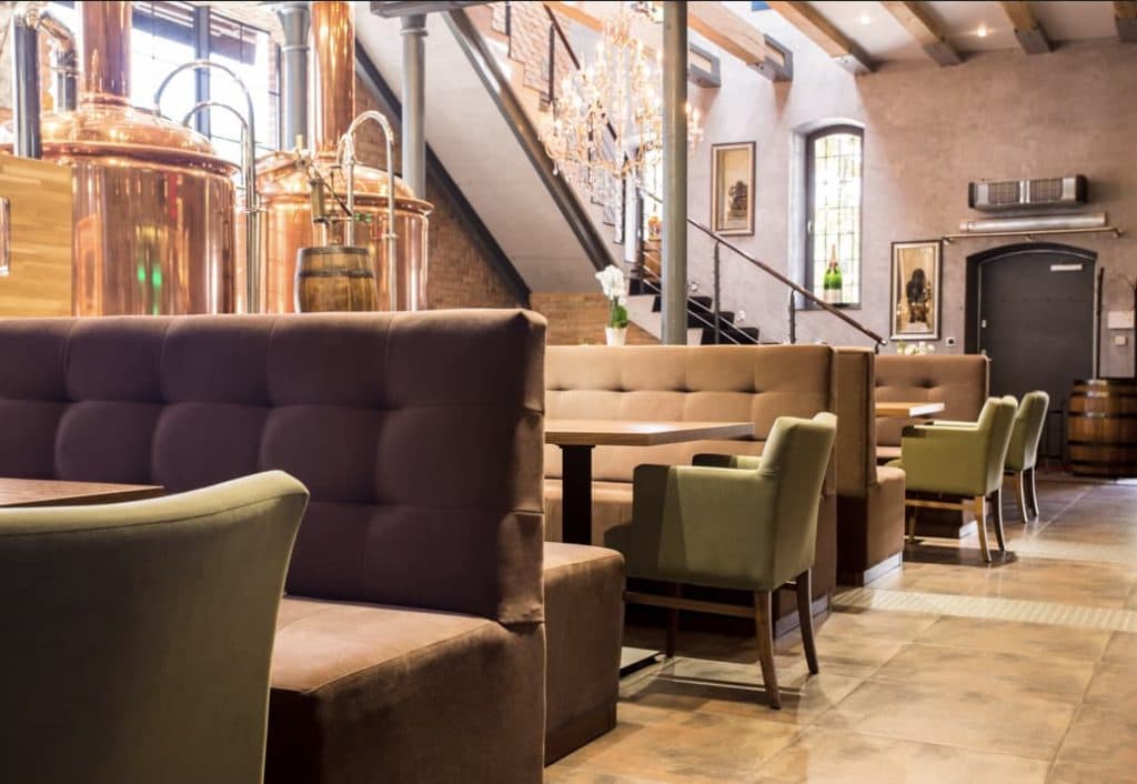
Fine Dining Restaurants: Opt for neutral and deep tones like burgundy, navy, and dark green for a luxurious ambiance.
Cafés & Bakeries: Soft pastels and earth tones create a cozy and inviting feel.
Health-Focused Restaurants: Green and organic hues reinforce freshness and wellness.
Tip: Choosing the right color palette helps reinforce your brand identity and influences how long customers stay.
How to Use Color in Different Elements of Restaurant Interiors
1. Choosing the Right Wall Colors for Your Restaurant
The walls are one of the most dominant visual elements in a restaurant. The color scheme should complement furniture, decor, and lighting to create a cohesive look.
Light colors make small spaces feel bigger and brighter.
Darker tones add warmth and intimacy but should be balanced with good lighting.
Accent walls in bold colors can create a focal point without overwhelming the space.
Tip: Consider the psychological effects of colors in restaurants when selecting paint or wallpaper.
2. The Role of Color in Restaurant Interior Design for Furniture and Decor
Tabletops & Chairs: Neutral tones work well for flexibility, while bold-colored seating can add personality.
Lighting & Fixtures: Warm lighting enhances cozy tones, while cooler lighting works well with modern, sleek interiors.
Flooring & Ceilings: Wooden textures pair well with earthy colors, while modern tiles work with monochromatic or industrial themes.
Tip: Balance bold colors with neutral furniture to avoid overwhelming the space.
3. Branding and the Role of Color in Restaurant Interior Design
The role of color in restaurant interior design is not just about aesthetics—it also plays a role in branding and marketing. The colors you choose should align with your restaurant’s logo, menu, and overall concept.
McDonald’s (Red & Yellow): Stimulates hunger and creates a sense of urgency.
Starbucks (Green): Reinforces sustainability and relaxation.
Chic Fine Dining Restaurants (Black & Gold): Evoke luxury and exclusivity.
Tip: Consistency in branding and restaurant color schemes helps build a strong visual identity.
Final Thoughts on the Role of Color in Restaurant Interior Design
The role of color in restaurant interior design goes beyond aesthetic appeal—it directly impacts customer mood, dining habits, and brand perception. Selecting the right restaurant color scheme can help you create an environment that attracts and retains customers while enhancing the dining experience.
Key Takeaways:
Choose colors that align with your restaurant’s theme and brand identity.
Consider psychological effects when selecting color schemes.
Use warm colors for fast dining and cool tones for relaxed atmospheres.
Incorporate modern color trends to keep your restaurant visually appealing.
Balance bold and neutral colors for a well-designed space.
By understanding the psychological effects of colors in restaurants, you can create an inviting, engaging, and profitable dining space.


2 Responses
We are architects and interior designer doing works in KSA
Hotels 3 and 4 stars
Are you furniture wood steel manufacturers
Please let me know something about you
Hello, could you give information about your project? You can send us an email.
in**@*******************pt.com