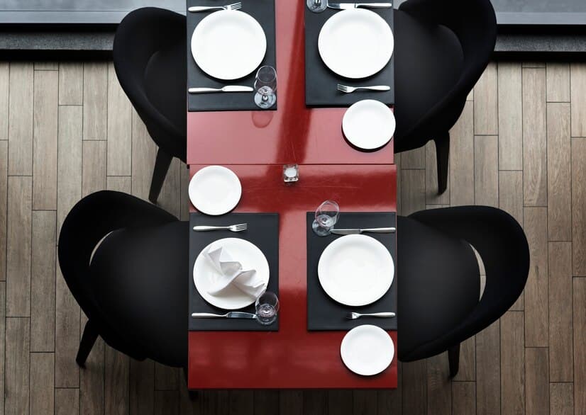
A restaurant furniture layout plan decides how many guests you seat, how fast your staff move, and whether the room feels comfortable or cramped — long before a single plate leaves the kitchen. Get the spacing and the zones right, and the floor works for you every service; get them wrong, and you either lose covers you needed or crowd the guests you have. The plan also depends on the furniture itself, so the pieces and the layout settle together — you can see the tables, chairs and booths that fit a plan in our restaurant furniture collection.
This guide walks through the zones a dining room needs, the spacing and aisle widths that keep service moving, the accessibility clearances the law requires, the rules that set realistic capacity, and the layouts that suit each concept. Every recommendation treats the room as a working restaurant, not a home dining room — a plan built to seat the most guests it safely can and to serve them quickly.
Quick answer
How do you plan a restaurant furniture layout? Measure the room and check the codes first, then map the zones — entrance, dining, bar, service stations and circulation. Set the aisles before the tables: keep main paths around 1.2 to 1.5 metres and service paths at least 90 centimetres. Place fixed seating such as banquettes along the walls to reclaim space, then fill the floor with a mix of two-tops and four-tops that combine for larger parties. Allow roughly 45 centimetres between occupied chair backs and confirm accessible routes and tables. Balance the most covers the room can hold against clear, comfortable flow.
Why a Restaurant Furniture Layout Plan Decides Your Covers
The layout is the single decision that sets your maximum revenue per square metre. Every table you fit raises capacity, and every path you protect keeps service fast — but the two pull against each other, and a good plan resolves the tension. A room that crams in tables loses guests who feel cramped and slows the staff who serve them; a room that spreads out too far leaves covers, and money, on the floor. The restaurant furniture layout plan is where that balance gets struck.
Layout sets capacity and revenue
Seating capacity translates directly into revenue, so the layout is a financial document as much as a design one. Plan it well and the same four walls hold more covers without feeling tight; plan it poorly and the room underperforms every night it opens. The goal is never the absolute maximum number of seats — it is the most covers the room holds while still feeling comfortable and serving quickly, because a cramped room that turns slowly earns less than a balanced one that turns fast.
The front-of-house and back-of-house split
Before you place a single table, divide the building. A common planning guide gives roughly 60 percent of the space to the front of house — the dining room, bar and waiting area — and 40 percent to the back of house, the kitchen, storage and staff areas. The exact split shifts with the concept, but the principle holds: the dining room needs the larger share, and starving it to enlarge the kitchen costs covers. Settle this split first, because it sets the envelope every table has to fit inside.
The most seats is rarely the most profit
Operators chase a seat count and forget that a packed room turns slowly, frustrates guests and burns out staff. The layout that earns the most balances covers against flow — enough tables to fill the room, enough space to serve them fast. A plan that adds two tables but slows every service often nets less than the one that left them out.
The Key Elements of a Restaurant Layout
A restaurant floor breaks into a handful of zones, and a layout works when each one gets the space it needs and connects cleanly to the next. The table below sets out the key elements of a restaurant layout and the job each does, so the plan covers every part of the guest and service journey.
| Zone | What it does | Planning priority |
|---|---|---|
| Entrance & waiting | First impression; holds guests at peak | Clear of the door swing and the main aisle |
| Dining area | The covers that earn the revenue | Mix of table sizes; protected circulation |
| Bar / counter | Waiting, walk-ins and a destination zone | Stool height and clearance behind seats |
| Service stations | Staff supply points that speed service | Reachable without crossing the room |
| Circulation | The paths guests and staff move along | Width set before tables go down |
Entrance and waiting area
The entrance sets the first impression and absorbs the queue at peak, so it needs room to breathe without blocking the path into the dining room. Keep the host stand clear of the door swing, give waiting guests somewhere to stand or perch that does not spill into the main aisle, and make the sightline into the room welcoming. A cramped entrance bottlenecks the whole service before a guest even sits down.
The dining zone
The dining area carries the covers, so it earns the largest share of the floor and the most careful planning. A productive dining zone mixes table sizes, runs fixed seating along the walls, and protects clear circulation through the middle. This is where the layout most directly turns square metres into revenue, so every decision here — table shape, spacing, the balance of two-tops and four-tops — feeds the cover count.
Service stations and circulation
Service stations and the paths between them decide how fast staff work. Place service points so a server reaches glassware, water and cutlery without crossing the room or weaving through guests, and protect the circulation routes that connect the kitchen, the stations and the tables. When the staff paths stay clear, service speeds up and the room turns faster — which is why circulation gets planned before the tables, not squeezed in around them.
How to Build a Restaurant Furniture Layout Plan Step by Step
A reliable restaurant furniture layout plan follows an order, and skipping a step almost always shows up later as a blocked aisle or a wasted corner. Work through the room in sequence and the plan resolves itself.
Start with measurements and code
Begin with an accurate measured plan and the rules that govern it. Record the room’s dimensions, the door swings, the columns, the exits and the fixed services, then check the local building and fire codes for exit widths, occupancy limits and accessibility requirements. These constraints set the boundaries every table sits inside, so resolving them first stops a layout that looks good on paper but fails an inspection.
Map circulation and aisles first
Draw the paths before the furniture. Mark the main circulation route guests and staff use, the service paths that reach every station, and the clearances around the bar and the exits. Protecting these routes first guarantees the room flows; filling the floor with tables and then carving aisles out of what is left almost always leaves the paths too tight. Circulation is the skeleton of the plan, so it comes before the seats.
Place fixed seating, then loose tables
With the paths set, place the fixed elements next. Run banquettes and booths along the walls to reclaim the perimeter, then fill the open floor with loose two-tops and four-tops that staff combine for larger parties. Working from fixed to flexible gives the room a stable frame and a movable centre, so the layout seats a quiet lunch and a large celebration from the same plan. To figure out the furniture layout, this fixed-then-flexible order is the most reliable method.
Table Spacing, Aisles and ADA Clearances
The numbers behind the plan decide whether it feels comfortable or cramped, so set the spacing deliberately. The table below collects the standard clearances a restaurant furniture layout works within, from the gap between guests to the accessible route the law requires.
| Measure | Typical clearance | Why it matters |
|---|---|---|
| Between occupied chair backs | 45 cm | Lets guests and staff pass behind seated diners |
| Table edge to table edge | 60 cm+ | Keeps neighbours from feeling crowded |
| Main circulation aisle | 120–150 cm | Two staff pass with trays; guests come and go |
| Service path | 90 cm+ | A server moves without weaving through guests |
| Accessible route (ADA) | 91 cm (36 in) | Wheelchair access along the main path |
| Sq. metres per seat | 1.1–1.9 m² | Sets realistic capacity by concept |
Spacing between tables
The gap between tables sets the comfort of the whole room. Allow at least 45 centimetres between the backs of occupied chairs so guests and staff pass behind diners without a squeeze, and keep table edges 60 centimetres or more apart so neighbours do not feel they share a table. Tighten these gaps to win extra covers and the room feels packed; widen them too far and you leave seats on the floor. The right spacing reads as comfortable without feeling empty.
Aisle and service-path widths
Aisles carry the service, so size them for the traffic they take. Keep the main circulation aisle around 120 to 150 centimetres so two staff pass with trays and guests move freely, and hold service paths at no less than 90 centimetres so a server never weaves through seated diners. A chair pulled out from a table must not block these routes, so account for the depth a seated guest takes when you set the aisle. Protected aisles are what let a full room still turn quickly.
ADA and accessibility spacing
Accessibility is a legal requirement, not an optional courtesy, so build it into the plan from the start. An accessible route through the dining room runs at least 91 centimetres wide, a share of the tables sit at an accessible height with clear knee space beneath, and the path reaches the entrance, the dining area and the restrooms without steps or tight turns. Planning these clearances early avoids a costly rework, and a genuinely accessible room serves more guests with less friction.
Plan for the pulled-out chair, not the tucked-in one
Layouts drawn with chairs tucked under tables look spacious and then jam the moment guests sit down and push back. A seated diner takes roughly 45 to 50 centimetres of depth behind the table edge, so plan the aisles and spacing around the pulled-out chair. The plan that works on a busy Saturday is the one drawn for occupied seats, not empty ones.
Maximizing Seating Capacity Without Crowding
The art of a layout is fitting more covers without the room feeling tight. A few techniques add capacity while protecting comfort, and the best plans use all of them together.
The seating-capacity rules worth knowing
A few planning rules give the layout a quick sanity check. The 30/30/30 idea splits the dining area roughly into thirds — circulation, seating footprint and flexible or waiting space — so no part of the room starves another. The 80/20 observation reminds you that a minority of tables, usually the booths and prime spots, drive much of the demand, so plan those first. Treat these as guides rather than laws, but a layout that ignores them often crowds one zone while wasting another.
Mix table sizes and shapes
A room of identical four-tops wastes seats every time two people sit at one. Mixing two-tops, four-tops and a few larger tables lets the layout match real party sizes and fill more seats, and square or rectangular tops pack more efficiently while combining cleanly for groups. Round tops ease flow in tight aisles. A considered mix of sizes and shapes is the simplest way to lift capacity without adding a single square metre.
Banquettes recover perimeter space
Fixed bench seating along a wall reclaims the clearance a freestanding chair wastes behind it, so banquettes and booths add covers a loose layout surrenders. A wall run also flexes — staff slide tables together for a party and apart for pairs — which adds capacity and adaptability at once. Our guide to restaurant booth seating covers how to design the benches that recover the most space.
Flexible and modular layouts
Furniture that moves multiplies what one floor plan can do. Tables that combine, chairs that stack and modular pieces let a single room serve a quiet weekday lunch and a private function from the same set, so the layout flexes with demand instead of locking into one configuration. For rooms that flip between uses, this adaptability is worth as much as raw seat count, because it captures the covers that variable party sizes bring.
Layouts by Restaurant Type
The right plan changes with the concept, because a fine dining room, a fast-casual space and a family restaurant ask different things of the floor. Match the layout to the way the room actually runs.
Fine dining layouts
Fine dining trades covers for comfort. The layout gives each table generous space — toward the upper end of the per-seat range — widens the aisles, and uses spacing itself to signal the tier and the privacy guests expect. Fewer, better-spaced tables turn more slowly but spend more, which the concept depends on. Here the plan deliberately leaves room, because the space between tables is part of the experience.
Fast-casual and café layouts
Fast-casual and café rooms run the opposite way, packing efficient covers and keeping the floor flexible. Tighter but still comfortable spacing, lighter and stackable furniture, and a clear path from the counter to the seats keep a high-turnover room moving. The layout favours two-tops and combinable tables that reset fast between guests, because speed and capacity drive the model. Efficient circulation matters most where the room turns quickest.
Small-space and family-friendly layouts
Tight and family rooms reward the most disciplined planning. In a small space, banquettes along the walls and tables that combine recover every usable centimetre, while a family-friendly layout leaves room for high chairs, prams and larger groups without blocking the aisles. Both follow the same rule: maximise the covers the room genuinely holds while keeping the paths clear and the seating comfortable for the guests it serves.
Common Layout Mistakes and Furniture Choices
Most layout regrets trace back to a handful of errors, and the right furniture choices prevent the rest. Settle both, and the plan holds up on the busiest night.
The biggest layout mistakes
The most common and costly placement mistake is the same across rooms of every size: squeezing in tables the floor cannot hold, which blocks aisles, crowds guests and slows service until the extra covers earn nothing. Other frequent errors include drawing the plan with chairs tucked in, ignoring the door swing and the service paths, and leaving dead corners no seating reaches. Each traces back to planning the tables before the paths — the order that protects against all of them.
Choosing furniture that fits the layout
The layout and the furniture settle together, because the wrong pieces undermine a good plan. Choose table sizes that match your party mix, chairs slim enough to tuck and tough enough to last, and fixed seating that fits the walls it lines. Our guides to restaurant chairs and the right restaurant tables cover the pieces that fit a plan, and our pillar on how to choose restaurant furniture sets the whole specification in context.
Frequently Asked Questions
What are the key elements of a restaurant layout?
A restaurant layout breaks into five core zones: the entrance and waiting area, the dining area, the bar or counter, the service stations, and the circulation paths that connect them. Each needs its own space and a clean link to the next, with the dining area earning the largest share and circulation planned before the tables.
How much space should you leave between restaurant tables?
Leave at least 45 centimetres between the backs of occupied chairs and 60 centimetres or more between table edges, so guests and staff pass without a squeeze. Keep the main aisle around 120 to 150 centimetres and service paths at no less than 90 centimetres. Plan these gaps around pulled-out chairs, not tucked-in ones.
What is the 60/40 rule in a restaurant?
The 60/40 rule is a common space-planning guide that gives roughly 60 percent of the building to the front of house — the dining room, bar and waiting area — and 40 percent to the back of house, the kitchen, storage and staff areas. The exact split shifts with the concept, but the dining room should hold the larger share.
How much space do you need per seat in a restaurant?
Allow roughly 1.1 to 1.4 square metres per seat for casual dining and fast-casual rooms, and 1.7 to 1.9 square metres per seat for fine dining where comfort and spacing matter more. The figure covers the seat, a share of the table and the circulation around it, so it sets a realistic capacity for the room rather than a raw seat count.
What are the ADA spacing requirements for restaurant seating?
An accessible route through the dining room runs at least 91 centimetres (36 inches) wide, a portion of the tables sit at an accessible height with clear knee space beneath, and the path reaches the entrance, dining area and restrooms without steps or tight turns. Confirm the exact requirements with your local code, and build the clearances in from the start.
How do you maximize seating capacity in a restaurant?
Mix table sizes and shapes to match real party sizes, run banquettes and booths along the walls to reclaim perimeter space, and use combinable and stackable furniture so one floor plan serves many configurations. Maximise the covers the room genuinely holds while keeping aisles clear and spacing comfortable — a packed room that turns slowly earns less than a balanced one.
What is the biggest mistake in restaurant furniture placement?
The biggest mistake is squeezing in more tables than the floor can hold, which blocks aisles, crowds guests and slows service until the extra covers earn nothing. It usually comes from planning the tables before the paths. Map the circulation and service routes first, plan around pulled-out chairs, and only then place the seating.