In short
Let the fixed element — usually the cabinets — lead, keep a clear step of contrast with matched undertones, and pair each cabinet colour with a wall that flatters its temperature. White cabinets take soft gray or greige; navy takes warm white; wood takes warm beige.
Getting kitchen cabinet and wall colour combinations right is the difference between a kitchen that looks considered and one that feels off, and the question that trips most people up is simply where to start. Should the cabinet colour lead and the walls follow, or the other way round? For a single home it is a matter of taste; for a hotel, aparthotel or project kitchen built in our contract kitchen cabinet workshop, the colour combination has to read well, repeat identically across every room, and still look current years later. This guide sets out which colour to choose first, the pairing rules that make combinations work, and the best cabinet-and-wall colour combinations — from the maker’s side, with the project in mind.
Most colour advice assumes one owner picking one kitchen for taste. The decisions that matter here are slightly different: which element anchors the scheme, how light and dark relate, which combinations read as expensive rather than cheap, and which colours date fastest — because in a project that colour repeats across a whole building and has to survive a refurbishment cycle. The sections below work through the combinations and the rules behind them, then close on coordinating colour for a contract kitchen.
Cabinet or Wall Colour: Which Comes First?
The order you choose colours in decides how easily the scheme comes together. As a rule, the harder element to change should lead, and in almost every kitchen that element is the cabinetry. Walls take an afternoon and a tin of paint to change; cabinets stay put, costly and long-lived, so the cabinet colour usually sets the scheme and the wall colour follows.
Why Cabinets Usually Come First
Cabinets dominate a kitchen visually and commit you for years, which is exactly why they should anchor the palette. Cabinet finishes also come in a narrower range than paint — a few hundred wall shades exist for every cabinet colour — so choosing the cabinet first and matching a wall to it is far easier than the reverse. For a timeless, neutral kitchen, a classic cabinet colour such as white, cream, gray, navy or a wood tone gives you a base that pairs with a wide range of walls. In a contract setting the logic is stronger still: the cabinets carry the brand and the cost, so the project fixes the cabinet finish first and treats wall colour as the adjustable layer around it.
When to Start with the Wall
Sometimes the wall leads, and it pays to recognise when. If a property already runs a fixed wall colour as part of its scheme, or the kitchen sits in an open-plan space that shares a palette with a living or dining area, the wall colour is effectively a given and the cabinets should complement it. A deliberate feature wall — a deep green, navy or charcoal — is another case where the wall comes first, with the cabinets chosen to sit calmly against it. The principle holds either way: whichever element cannot easily change leads, and the flexible one adapts to it.
Quick answer
Should kitchen cabinets be lighter or darker than the walls? Most kitchens look best with cabinets and walls a clear step apart in tone, and the more flexible arrangement keeps the cabinets as the stronger, often darker element with lighter walls around them — which makes the cabinetry read as the anchor and the room feel open. The reverse, light cabinets against a darker wall, also works for a bolder look. What rarely works is cabinets and walls at the same depth of tone with no contrast, which flattens the whole kitchen.
The Rules That Make Combinations Work
Good colour combinations are not guesswork; a few simple rules explain why some pairings sing and others fall flat. Knowing them lets you judge a combination before you commit, and apply it consistently across a project rather than room by room.
The 60-30-10 Rule
The most useful rule in kitchen colour is the 60-30-10 split. Roughly 60 per cent of the space is a dominant colour, 30 per cent a secondary, and 10 per cent an accent — and a kitchen maps onto it neatly. The walls and large surfaces carry the 60 per cent, the cabinets the 30 per cent, and the hardware, accessories or an island the 10 per cent accent. Keeping that proportion stops a scheme tipping into chaos, because the eye has one main colour to rest on and the others support it. When a kitchen feels busy or unbalanced, it usually breaks this ratio, with two or three colours all fighting to dominate.
Lighter or Darker — and the Same-Colour Question
Contrast between cabinets and walls is what gives a kitchen depth. A clear step in tone — lighter walls against darker cabinets, or the reverse — reads as intentional, while cabinets and walls at the same value blur together and flatten the room. A common question is whether cabinets and walls should be the same colour: they can share a colour family, but they should differ in depth or finish so the cabinetry still reads as a distinct element. Matching them exactly works only in a very pared-back, tonal scheme done deliberately; done by accident, it simply looks like a missed contrast.
Contrast, Undertone and Flow
Beyond light and dark, undertone decides whether two colours actually agree. A warm cream cabinet against a cool gray wall can clash even though both are neutral, because their undertones pull in opposite directions; matching warm with warm and cool with cool keeps a combination harmonious. Flow matters too — in an open-plan space the kitchen colours should carry through to the adjoining rooms rather than stopping at an invisible line. Test undertones together, in the actual space, before committing, because a swatch that looks right on paper can turn under the room’s own light.
Best Cabinet and Wall Colour Combinations
With the rules in place, the practical question is which specific combinations work. The pairings below start from the cabinet colour — the element that usually leads — and give the wall colours that flatter each. The chart sets them out at a glance.
White and Cream Cabinets
White and cream cabinets are the most forgiving base and the most common in hospitality, because they pair with almost anything and keep a kitchen bright. White cabinets sit beautifully against soft gray, greige or a pale blue wall, giving a clean, timeless look; cream and off-white cabinets, being warmer, prefer warm partners such as beige, sage green or taupe. The one combination to handle carefully is white cabinets against a stark white wall, which can feel clinical — a hint of warmth or a soft contrasting wall keeps it inviting. For a project that wants longevity, a white or cream cabinet is the safest anchor there is.
Gray Cabinets
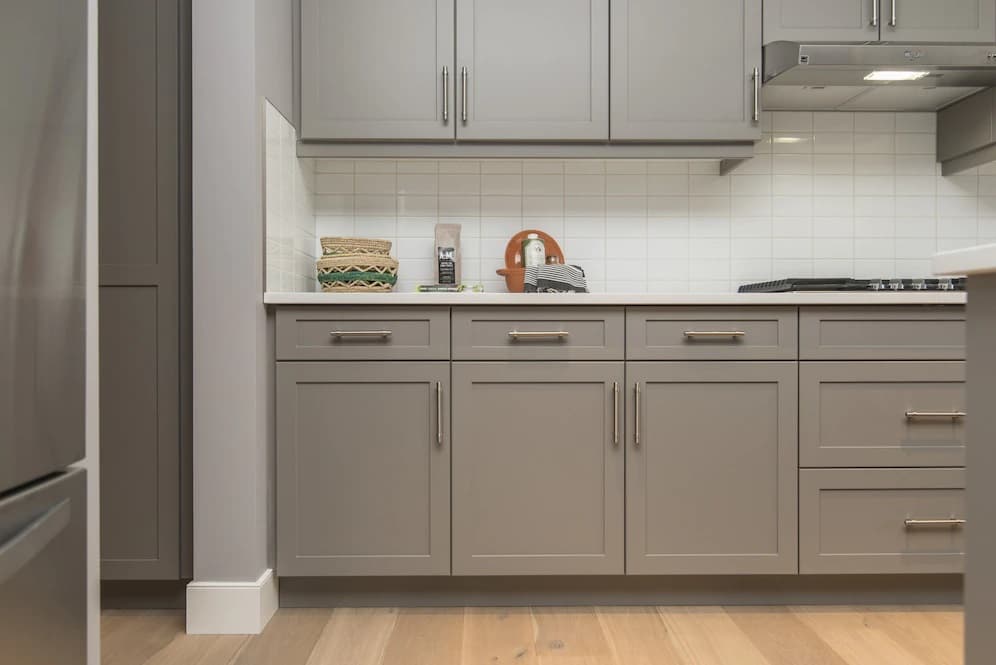
Gray cabinets read as modern and calm, and they want a wall that lifts them rather than doubling down on gray. Crisp white and off-white walls keep a gray kitchen fresh and let the cabinets read as the feature; a soft blue wall adds a gentle, cool note that suits the undertone. The trap with gray is matching gray cabinets to a gray wall of similar depth, which can feel heavy and dated — the contrast of a lighter wall is what keeps a gray scheme current. Watch the undertone, too: a cool gray cabinet pairs with cool whites, a warmer greige with warmer ones.
Navy, Green and Bold Cabinets
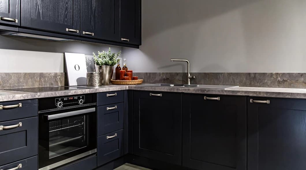
Deeper cabinet colours — navy, forest green, charcoal — make a confident statement and need a wall that gives them room to breathe. Navy cabinets look their best against a warm white, a soft taupe or even a blush wall, which softens the depth without competing; green cabinets pair with cream, soft white or a warm gray for a natural, grounded feel. The key with any bold cabinet is restraint on the walls — a quiet, light wall lets the cabinetry be the star, where a second strong colour would turn the kitchen into a contest. These darker schemes suit larger, well-lit kitchens best.
Wood-Tone Cabinets
Wood and oak cabinets bring warmth and texture, and their undertone — honey, walnut or a cooler oak — steers the wall choice. Light oak cabinets sit well against warm beige or a crisp white; richer walnut tones can carry a deeper partner such as olive green; and a mid wood pairs happily with a soft, warm neutral. Because wood already adds colour and grain, the walls usually do best staying quiet and warm, letting the timber be the character. A wood cabinet against a clashing cool gray is the combination to avoid, since the undertones fight; keep the wall in the warm family and a wood kitchen always reads naturally.
The table below condenses these pairings into a quick reference, with the effect each combination creates.
| Cabinet colour | Best wall colours | Effect |
|---|---|---|
| White | Soft gray, greige, pale blue | Clean, bright, timeless |
| Cream | Warm beige, sage, taupe | Warm, classic, inviting |
| Gray | Crisp white, off-white, soft blue | Modern, calm, fresh |
| Navy | Warm white, taupe, blush | Confident, deep, contemporary |
| Green | Cream, soft white, warm gray | Natural, grounded, current |
| Wood / oak | Warm beige, olive, crisp white | Warm, textured, characterful |
A common question: what wall colour goes with beige walls already in place
When the wall colour comes first — a beige or greige already on the walls — the cabinets become the variable. Against warm beige walls, cabinets in crisp white, a soft sage green or a natural wood tone all work, because each shares or complements the warm undertone; a cool gray cabinet, by contrast, can read cold against beige. The same logic applies to gray walls, where warm white, navy or wood cabinets sit comfortably. Start from the undertone of the fixed wall, match the cabinet to its temperature, and the combination holds — the mistake is pairing a warm wall with a cool cabinet, or the reverse.
Two-Tone, Lighting and Kitchen Size
Beyond the basic pairing, three factors shape how a colour combination actually looks in the room: whether you split the cabinets into two tones, how the light falls, and how big the kitchen is. Each can make the same colours feel completely different.
Two-Tone Cabinets
A two-tone scheme — darker base cabinets under lighter or wood wall units, or a contrasting island — adds depth without changing the wall colour at all. It works because it builds the contrast into the cabinetry itself: a navy or green base grounds the kitchen while white or wood uppers keep it light, and the walls can stay quiet. Two-tone suits larger kitchens and islands especially, and it lets a project introduce a brand colour on the base run while keeping the bulk of the kitchen neutral. The rule is to keep one of the two tones neutral, so the combination reads as considered rather than busy.
How Lighting Changes Colour
The same colour combination can look warm and inviting in one kitchen and cold in another, and lighting is usually why. Natural light shifts through the day, and artificial light has its own temperature — a warm bulb pushes colours yellow, a cool one pushes them blue. A gray that looks elegant in a bright, north-lit showroom can turn flat and dull in a dim interior room. Always test cabinet and wall colours together under the kitchen’s actual lighting before committing, because the light the kitchen lives under decides how the combination truly reads.
Kitchen Size and Colour
Size steers how light or dark you can go. Small kitchens and compact kitchenettes benefit from lighter cabinets and walls — white, cream, pale neutrals — which bounce light and make a tight space feel open; dark colours in a small, dim kitchen close it in. Larger kitchens can carry darker cabinets, bold walls and stronger contrast without feeling heavy, and a balanced approach of one dark element against a lighter one reads best. For an aparthotel full of compact kitchens, light combinations are almost always the safer specification, keeping every small kitchen feeling more spacious than its footprint.
Colours to Avoid, Trends and the Expensive Look
Knowing which combinations work is only half the picture; knowing which to avoid, what is dating, and what reads as expensive protects a kitchen from looking cheap or tired before its time — which matters most when the scheme repeats across a building.
Colours to Avoid and What Dates
A few choices reliably let a kitchen down. Very trend-driven, saturated cabinet colours date fastest and are the hardest to live with at scale; cabinets and walls at the same flat tone with no contrast read as a mistake; and clashing undertones — a warm cabinet against a cool wall — unsettle a scheme even when each colour is fine alone. Overly cool, stark gray, the default of the last decade, is now the colour most likely to feel dated. The safest path for longevity is a neutral or natural cabinet, a complementary wall, and a single accent — restraint dates far more slowly than a strong statement.
2026 Trends — What Is Replacing Gray
The clear shift in kitchen colour is away from cool gray toward warmer, more natural tones. Warm whites, creams, greige and earthy neutrals are replacing the gray that dominated, alongside nature-led cabinet colours such as soft sage and forest green and warm wood tones. The mood has moved from cool and minimal to warm and grounded, which is why a greige or warm-white scheme now feels current where a cold gray feels of its moment. For a project specifying today, leaning warm and natural is the choice most likely to still read well across a refurbishment cycle — trends move, but warm neutrals age slowly.
The Look That Reads as Expensive
Kitchens that look expensive rarely use expensive colours; they use disciplined ones. A tight palette — one cabinet colour, one complementary wall, one quiet accent — reads as considered, where a jumble of colours reads as cheap however good the materials. Depth and contrast handled well, matched undertones, and a restrained accent in a quality finish do more for a premium look than any single bold colour. The expensive look is mostly restraint: fewer colours, chosen to agree, applied consistently. That principle scales perfectly to a project, where consistency across rooms is exactly what signals quality.
In a project, colour is a code — chosen once and repeated, not picked per room
The biggest difference between a home kitchen and a contract one is that the colour combination is not a one-off decision — it is a standard. A hotel or aparthotel fixes the cabinet finish to a precise colour code, pairs it with a specified wall colour, and repeats that exact combination across every room in the building, so the property reads identically from the first kitchen to the last. That makes two things matter more than taste: choosing a combination that ages slowly, since the property will live with it for a full cycle, and locking the colour to a code a manufacturer can reproduce on a lacquer finish run after run. Get the combination right once and the whole building benefits; get it wrong and the same mistake multiplies across hundreds of rooms.
Kitchen Colour Schemes at a Glance
Buyers rarely ask for a single colour. They ask for a scheme — a cabinet tone, a wall tone and a worktop that agree with each other. The table below names the combinations that keep appearing in project specifications, and says where each one earns its place. Use it as a shortlist, then test the shortlist under the actual lighting of the room.
| Scheme | Cabinets | Walls | Works best in |
|---|---|---|---|
| Warm neutral | Greige or mushroom | Soft off-white | Serviced apartments and mid-scale kitchens that must not date |
| Two-tone classic | Deep navy or forest below, off-white above | Pale warm white | Villa and residence kitchens with height to spare |
| Wood and white | Oak or walnut veneer | Chalk white | Boutique properties that want warmth without strong colour |
| Monochrome graphite | Charcoal or anthracite | Light grey | Compact urban kitchens with good artificial light |
| Soft green | Sage or olive | Warm white | Properties leaning on a natural, calm identity |
| Cream and brass | Cream or bone | Warm beige | Classic and heritage schemes where brass hardware leads |
Reading a Scheme From a Photograph
Photographs of kitchen colour combinations sell a look and hide the conditions that produced it. Before you copy one, ask three questions: how much daylight reached that room, what colour temperature the artificial light used, and what the worktop contributed. A scheme that reads warm under 2700K lamps turns grey under 4000K, and the same cabinet door photographs differently against stone than against laminate. Order a door sample and view it in the actual room before the order goes to production.
How Many Colours a Scheme Should Carry
Three is the working limit: one for the cabinets, one for the walls, one for the worktop and hardware together. A fourth colour has to earn its place, usually as a single island or a splashback. Projects that run past four colours rarely look richer; they look unresolved, and they cost more to reorder because every element carries its own lead time.
Field insight
Name the scheme in the specification
Write the scheme down as a named set — cabinet reference, wall reference, worktop reference, hardware finish — rather than as four separate lines in four separate documents. A named scheme survives a change of site manager; four loose references do not.
Coordinating Colour for a Project Kitchen
For a contract kitchen, a good cabinet-and-wall combination is the start, not the finish. The colour has to coordinate with the worktop, splashback and hardware, and it has to be reproducible across a whole building — which is where specification meets design.
Worktop, Splashback and Hardware
Cabinets and walls never sit alone; the worktop, splashback and hardware complete the combination and can make or break it. The worktop is the second-largest colour surface after the cabinets, so its tone and pattern have to agree with both cabinet and wall — a busy stone against bold cabinets fights, where a quiet one supports. The splashback bridges cabinets and walls and is the place to add interest or keep calm. Hardware is the 10 per cent accent: matched, quality handles in a finish that suits the scheme pull it together. Coordinate all of these on the drawing, not on site, so you resolve the full combination before production.
Matching Colour to a Brand Standard
A lacquer finish is what lets a project hold its colour exactly. Because lacquer opens the full colour palette and reproduces a precise code, a property can match cabinets to a brand colour and repeat it across every kitchen with no drift between rooms. That is the contract advantage over off-the-shelf cabinetry, which limits you to a fixed range. As a workshop we produce contract kitchen cabinets in any specified colour and finish — lacquer, laminate, veneer or wood — matched to a code and built to your drawings, for hotels, aparthotels, villas and projects, on FOB or CIF terms with a four-to-eight-week lead time and a two-year warranty. For the wider picture of specifying a project kitchen, our contract kitchen cabinet guide covers boards, doors and layouts, and the cabinet material guide covers how finish meets substrate.
Kitchen cabinet and wall colour combinations come down to a short chain: let the fixed element — usually the cabinets — lead, keep a clear step of contrast with matched undertones, hold the 60-30-10 proportion, lean warm and neutral for longevity, and test the pairing under the kitchen’s own light before committing. Resolve the worktop, splashback and hardware into the same combination, lock the colour to a code, and a project’s kitchens read consistently and stay current across the cycle. Choose the combination once, with care, and it works in every room it repeats across.
Frequently Asked Questions
Should kitchen cabinets and walls be the same colour?
They can share a colour family but should differ in depth or finish, so the cabinetry still reads as a distinct element. Exact matching works only in a deliberate, pared-back tonal scheme; done by accident it simply looks like a missed contrast. A clear step in tone between cabinets and walls almost always reads better and gives the kitchen depth.
Should kitchen cabinets be lighter or darker than the walls?
Most kitchens look best with cabinets and walls a clear step apart in tone. The more flexible arrangement keeps the cabinets as the stronger, often darker element with lighter walls around them, so the cabinetry anchors the room and the space feels open. Light cabinets against a darker wall also work for a bolder look. What rarely works is the two at the same depth with no contrast.
What is the 60-30-10 rule for kitchens?
The 60-30-10 rule splits a scheme into roughly 60 per cent dominant colour, 30 per cent secondary and 10 per cent accent. In a kitchen the walls and large surfaces usually carry the 60 per cent, the cabinets the 30 per cent, and the hardware, accessories or island the 10 per cent accent. Holding that proportion keeps a combination balanced and stops competing colours making the kitchen feel busy.
What colour cabinets go with beige walls?
Against warm beige or greige walls, cabinets in crisp white, soft sage green or a natural wood tone all work well, because each shares or complements the warm undertone. A cool gray cabinet can read cold against beige, so it is the one to handle carefully. Start from the undertone of the fixed wall and match the cabinet to its temperature, pairing warm with warm.
What colours make a kitchen look expensive?
Expensive-looking kitchens use disciplined colour rather than expensive colour. A tight palette of one cabinet colour, one complementary wall and one quiet accent reads as considered, while a jumble of colours reads as cheap however good the materials. Matched undertones, well-handled contrast and a restrained accent in a quality finish do more for a premium look than any single bold colour.
What colour is replacing gray in kitchens in 2026?
The shift is away from cool gray toward warmer, more natural tones. Warm whites, creams, greige and earthy neutrals are replacing gray, alongside nature-led colours such as soft sage and forest green and warm wood tones. The mood has moved from cool and minimal to warm and grounded, which is why a greige or warm-white scheme now feels current where a cold gray feels dated.
What are the best colors for kitchen cabinets?
The safest cabinet colors for a project are warm neutrals — greige, mushroom, bone and soft off-white — because they survive a decade of taste changes and reorder cleanly. Deep navy, forest green and charcoal work well on lower cabinets in a two-tone scheme. Strong trend colors carry the most risk, since a discontinued paint reference makes a matching replacement door difficult years later.
What paint colors work best in a kitchen?
Warm whites, soft greys and muted greens work in almost any kitchen because they hold their character under both daylight and artificial light. Cool bright whites can read clinical under 4000K lamps, and saturated colors on wall surfaces shrink a small room. Always test a sample board in the actual room under the lighting that will be installed.
What kitchen color schemes are popular right now?
Warm neutrals have replaced cool grey as the default, and wood tones are back alongside them. The combinations appearing most often in current specifications are greige cabinets with off-white walls, two-tone navy and white, oak veneer with chalk white, and sage green with warm white. See the scheme table above for where each one suits a project.